The other day I read an article about how backgrounds are really not needed in webcomics or comics in general. I was rather shocked by the attitudes and perceptions that backgrounds were unimportant in the story telling process and that head shots and just character figures could make a story or comic successful.
Truth be told, Backgrounds are more than just a luxury or eye candy I find a that backgrounds and strong page layouts are crucial to effective story telling. That the elimination of these elements completely from a comic is kind of a cop-out by the artist. I hope as we chat a little today you will see the need and the purpose of the background and how it can be such a powerful tool in the story process.
Now some strips honestly, and I will be the first to admit it, don’t always need backgrounds in every panel. Each part of layout plays an important part in telling a story, it’s learning how to use each element successfully that can determine a strong storyteller. There is a place for the headshot, the character without anything behind them in a panel or maybe one or two props, that help establish a bit of realism or perspective of the room they are in. Yet the backgrounds have the power to remind us of where we are at, and reduce the need to sometimes spell everything out in text.
Now I blur the word environment and background. I find them to be virtually the same when I am working on the Bean. I build my backgrounds into my layouts and I am not afraid to bring them into the foreground when needed. I have found that the more I use them in my storytelling – the stronger I see that the story becomes. Also mind you I am working on a full epic story (530 pages posted), yet I have found these rules also apply to small stories, one shots, and general illustrations.
Treating your background/environment as it’s own character.
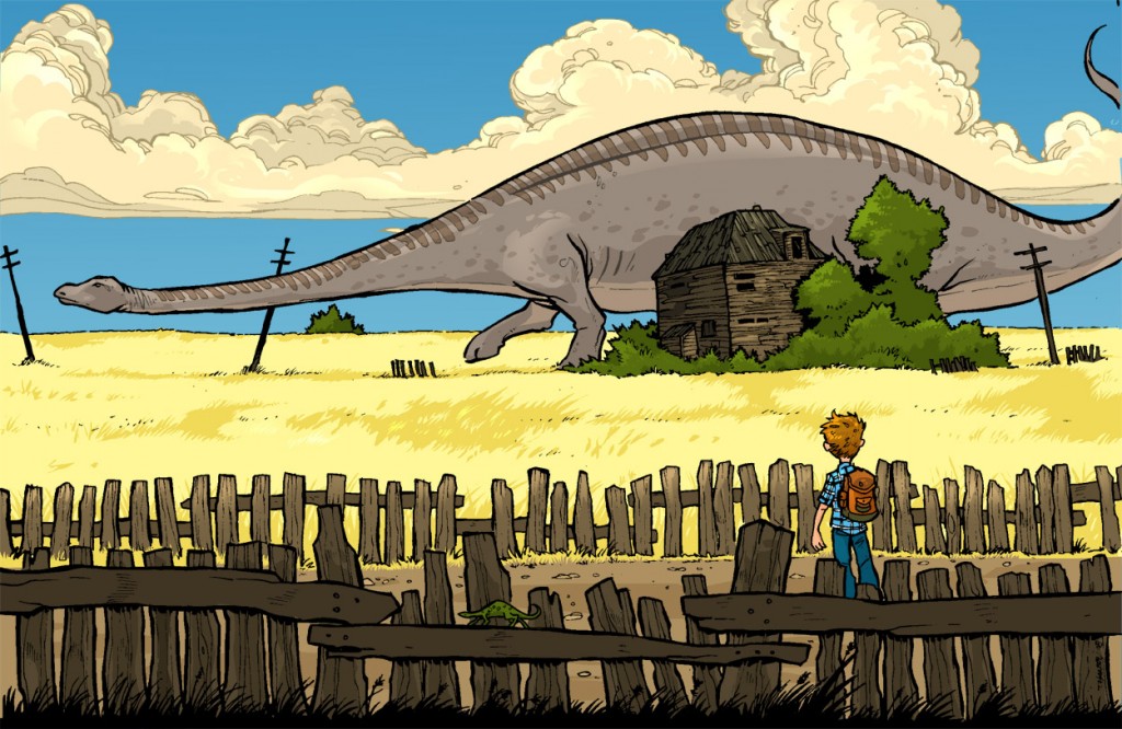
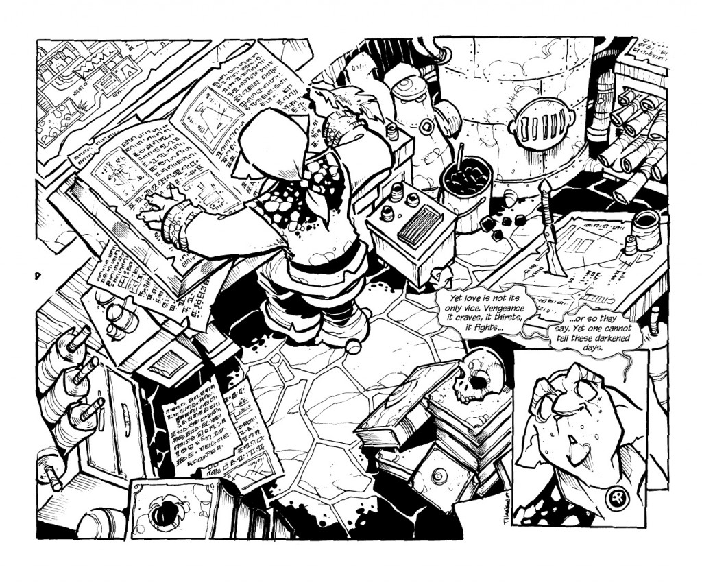 Huh? When I first created the Bean, I found that the more I added detail to my world the more it became alive. It literally became it’s own character. It made the world I was creating believable and alive. Pulling the reader into not just the story I created but the world itself. I found this to be extremely helpful in establishing cultures, personalities, and even story elements.
If the character, I was drawing was a slob, his room or area needed to reflect that. It made the character a little more believable. The trinkets and trash had to have meaning to him and by adding elements that I believe he would have consumed or tossed around it added to his personality and character. Yet is the character was a collector, than his room needed to feel like an overstuffed museum. His history on the walls and the floor, each item telling their own story.
If my characters were outside and wandering (which they are doing now) I needed to make the world around them alive. Which takes me to my next point…
Backgrounds have the power of establishing emotion…
Really? Yes, really. Going back to my wondering characters, a good strong background allows the reader to feel the emotions my characters are going through without one of them having to explain it to the reader. Just the barrenness of the landscape and your group pushin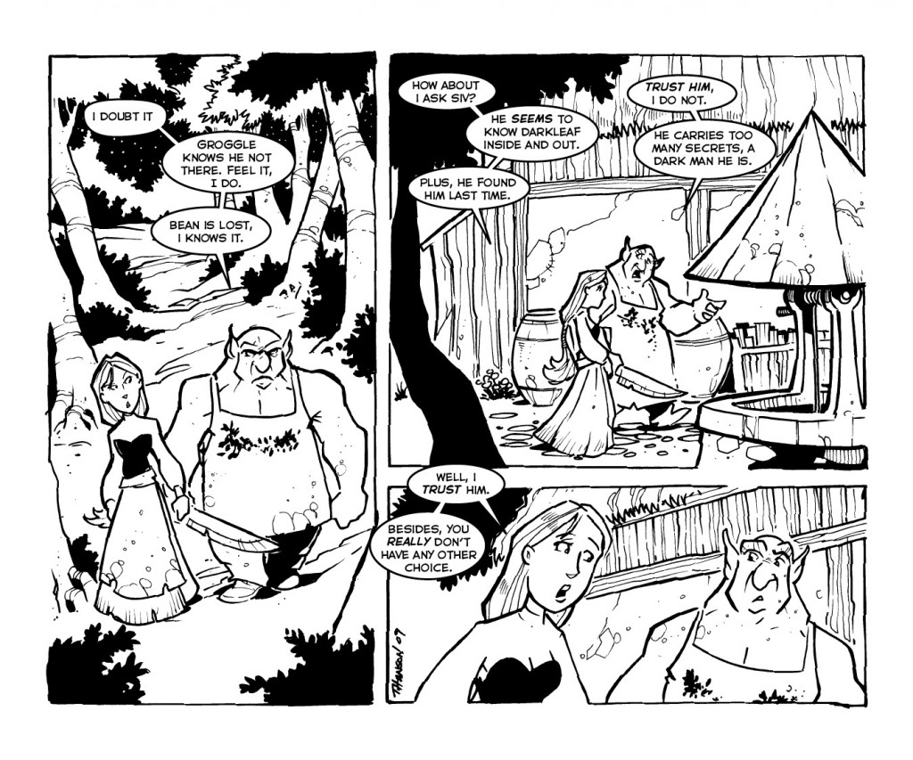 g through, can give the reader a true feeling for what the experience is. It allows the characters to become more alive, to look at things and feel more than just paperdoll cutouts on a white canvass. It even allows you to convey the power of a characters personality… childlike characters stop and look and touch – while the more focused characters of the scene might just be pushing on ignoring the world around them.
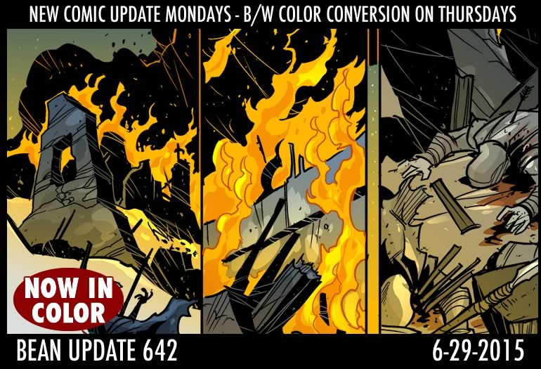
It can create dread, worry, happiness and most important the feeling that one truly understands the world your characters and people live in. It also serves a reminder at times for the emotional experience you might be trying to convey in your story… for example… Two characters enter a ruined village and began a conversation… which drifts here and there, by adding environment and background… not even detail you can create subtle reminders that they are still in a ruined village and that they might even possibly be in danger, without having the characters even explain to the audience what is going on. That’s because the audience already sees it. They know it and your backgrounds act as that quiet reminder that something might happen.
Establishing realism through background and layouts
This is really important for the comic creator that wants his world, imaginary or not to feel real. Even some of the best cartoonist pushed themselves to have a sense of realism in their works. Gary Larsen, Bill Watterson, Jim Davis (when he drew the strip), Bill Keane… etc. They understood the purpose of perspective, layout and the importance of building a believable environment for their characters (just look at the sunday comics). Most comic book creators understand this as well. Keen readers pick up on the fact that the artist takes the time to make a room believable. Dressers always in the same spot, lamps that don’t move positions, desk layouts that stay the same… store shelving that helps establish location. It can make a room feel small. This is also the bane of many illustrators, myself included at times as I try to remember where I left the sword or the dagger. Is the backpack on otter right? etc… But it sets you apart as a creator when you do these things.
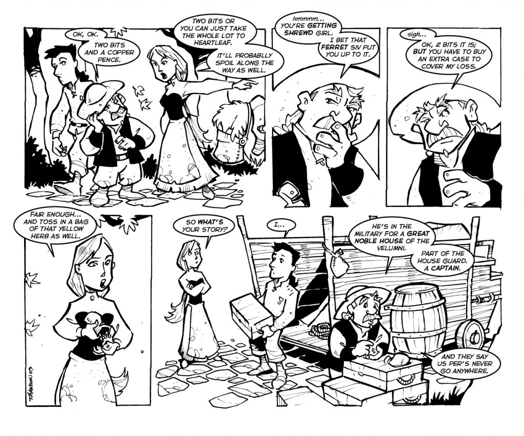 Making your backgrounds feel like they actually belong.
This is important. Just throwing a background into a piece or throwing things here and there can actually take away from a strip. Things need to belong, they need to feel like they are part of the environment and not just standard basic illustrations put there to fill space. William Stout, pointed this out to me many years ago – the need to make things feel like they belong in the backgrounds, and that they were different from each other. Meaning not all trees or bottles look alike. That by adding a little personality to the background, your world stops being mundane and becomes a realistic possibility.
Backgrounds take work and practice.
One of the truest and most honest reasons people do not put backgrounds into their works is because they hate drawing them. They are a challenge, and can be quite frustrating. In fact they can be a huge source of aggravation, felt it myself many times.
So what do you do? well start researching things out. Actually take a moment and look at your script and plan a little. Work with your writer if you can, find out what belongs in the background and why and then you go out and learn how to add that into your world. One of the hardest things for me was learning how to pull my horizon line up a little more and draw things smaller to give them distance. It was a test of my faith and honestly one of the biggest and most frustrating things to learn in my career. Yet it was worth every bit of aggravation and I am still learning on how to improve my craft. Yet what most people do not realize is how much time, practice and patience actually goes into learning how to actually draw and layout things correctly using perspective.
I have found google images, national geographic and magazines a god send in helping me learn to draw different backgrounds, props and actually placing people to fit in the environments correctly. It has also improved the layout and feel of comic. Which helps the story.
Backgrounds can make the mundane interesting.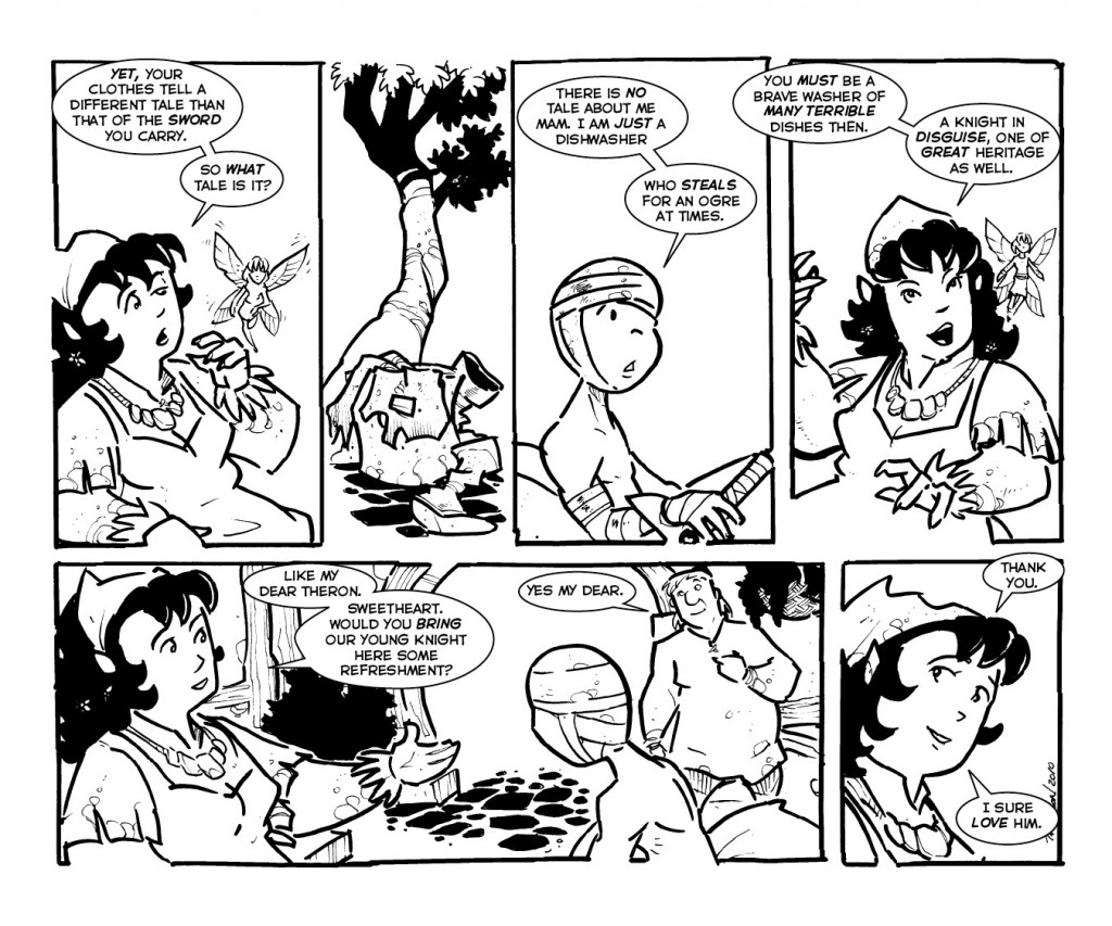
Ok lets be honest. There are moments in every strip that seem to just drag. They are important to plot and explaining a crucial thing, but the easy way out is to just draw the characters explaining something and looking off into one direction or the other… Nothing else to look at on the page, and if you have several updates of this due to the complexity of the joke or story… it can actually put off readership a little. The background gives them something else to look at. It allows the camera to pan back, go in another direction or help establish a location in creating a mood. It also allows you to change up the layout. It gives you more creative control and feeling and it can really help these slower parts flow better, PLUS it sometimes gives characters things to play with when they are just talking. Watch people talk to one another, most people are fidgety, they are doing something.. they hey… wait for it… interacting with their environment. This is noticed.
Some of the best comics I have ever read where by creators who truly understood the value of the background and environment. These are the stories and books I still read. These are the ones I admire and strive to be like, these are truly the master story tellers.
So before you get ready to dismiss the need for a background, stop and look at the comics and artist you look up to and enjoy. Look at how they value the importance and need of a background. (if they don’t that’s ok) But I will tell you – your credibility will improve as an effective story teller if you can learn to utilize and adapt backgrounds into your works.
Keep creating
Trav






I can't say enough good things about the atmospherics of your art. It's so immersive!
Sven Böttcher
the young Hero find “the sword” and must proof himself against a huge Monster. Hmm.. with the last Page i hear the “Bossfight Theme” from Secret of Mana.
Rumblefeather
Bob!!!! Oh goddess!!!!! What have they done to you?!